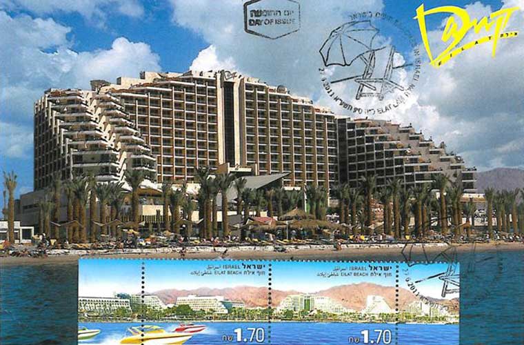
The architecture of Dan Eilat / Michael Yakobson
Dan Magazine 28/02/2016
Dan Eilat’s design remains exactly as it was when the hotel opened in Hanukkah 1995. 21 years have passed, and the Hotel’s management continues to meticulously preserve original sofas, carpets, signposts, curtains, lamps, mirrors and handles – which is quite exceptional in the Israeli hotelkeeping landscape.
The only things missing are the original plates designed especially for the hotel, and the original dining room design. The Hotel has recently began updating the guest rooms, with the idea to incorporate elements from the original decor. In a sense, this is a true time tunnel, since now-a-days they do things quite differently. The color pallet and lines are characteristic of the 1990s. The quality of the design is what makes a tour of the Hotel so fascinating. It is uncertain for how much longer this design will remain, so a visit to the Hotel is recommended before part of its decor will be renovated.
Dan Eilat is the result of a collaboration between several designers. A combination of art and architecture can be found in several of the Dan hotels. However inappropriate maintenance and insufficient appreciation of the original design often create a scattered, inconsistent atmosphere at hotels, in Dan Eilat one can still admire the total design in its complete state.
Reserve a Room now in Dan Eilat Hotel >>
The project was planned by Architects Albert Segal and Yechiel Komet from Gartner-Gibor-Komet. American Landscape Architect Howard Fields was in charge of the Hotel’s open spaces, together with the Israeli Landscape Architect Bruce Levin. The dominant interior decor was the responsibility of Israeli-American Architect Adam Tihany, and the signposts and logo were designed by Seffy Matiuk. The team of designers was preceded by a think tank which engaged professionals from other fields such as textile, theatre and music, headed by Ami Federmann, one of the Dan Chain’s owners and himself a design and architecture enthusiast.
A visit to the Hotel:
The Hotel turns its back to the street and its northern aspect. Eilat’s hotel district is crisscrossed by roads that intervene between a random collection of hotels and which generate whirlpools.
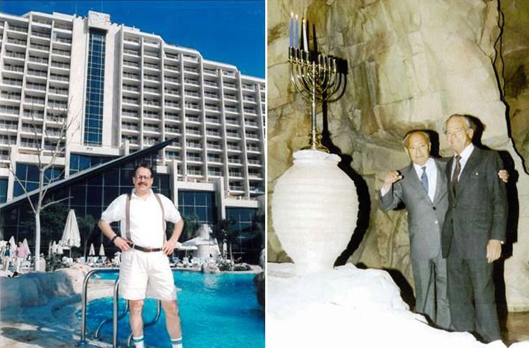
Dan Eilat’s symmetric design has two identical entrances. One of the entrances is closed to later become the group entrance. Each entrance reveals a towering wall, three stories high, clad with what appears to be stone, also featured in the swimming pool area (in fact this is glass fibers reinforced concrete, precast on special order in the US and assembled on site).
Normally a waterfall would cascade along the stone wall, but the diversion of water pipes now prevent its operation. At the group entrance the waterfall is active and collects in a fish pond. Facing it is a cage with six parrots and one iguana. The sign attached to the cage informs us that the cage’s design and its inhabitants are supervised by the Jerusalem Biblical Zoo. In the past there was also a monkeys’ cage which were replaced, following protests with birds, and was eventually removed altogether. The lobby is split to two interlinked levels, the top partial level actually functioning as a gallery with wide bridges connecting its segments.
A color pallet of orange and purple with sharp lines and a somewhat psychedelic décor, all remind me of one of my favorite Tim Burton movies, Beetlejuice, which he directed at the height of his creative period. From a local perspective, in the mid-1990s we were surrounded by postmodern design that played around with form and color, especially on television; in Channel 2 broadcast branding; in settings and costumes for television programs such as Ha Comedy Store, Margol and Rashut Habidur. These were the exultant, prosperous and promising 90s. Rabin was prime minister, peace agreements were signed one after the other. Days of the Messiah.
The carpets and tiling are the second component which is prominent throughout the Hotel. Despite a homogeneity of form and color, every carpet was designed and designated for its specific location. A whole catalogue, so it seems, can be comprised of the Hotel’s myriad carpet designs. Each carpet design was clearly tailored to the direction and flow of movement across it, and to the furniture and walls which enclose it. The colors tend to run wild in the guest rooms’ corridors, while in the elevator area shapes are relatively calm.
The carpets in the corridors follow the movement to and from the rooms, and exhibit delirious shapes on a scale reminiscent of small paving stones. In the lobby, on the other hand, the carpets play second fiddle to the natural Galilee-quarried stone paving. The use of stone in the lobby continues around the exterior swimming pool, hinting to the link between the inside of the Hotel and its exterior, which is a central theme in its design.
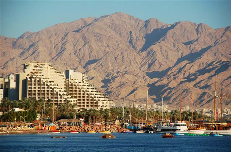
Guest rooms overlook the pool with the rock in its center, which at summertime functions as a restaurant. One can sit in the water while drinking at the bar. What I find interesting though, is the perspective on the Jordanian neighbor – Aqaba. Its state of the art port harbors huge cargo ships, with a huge flag towering 130 meters high. Aqaba (for now) does not have hotels as large as Eilat’s, but three years ago Jordan had accepted a 19 km long shoreline from Saudi Arabia, and I wonder if new hotels and attractions there will compete with Eilat’s in the coming years. In the meantime business in Eilat is as usual, and it doesn’t seem anyone here is preparing for competition.
In the beginning:
The Dan Hotels chain purchased the land in 1980, handing the architectural design to the Chain’s architect – Heinz Fenchel. Fenchel prepared a design for the new hotel in Eilat, but the plan was postponed and did not materialize due to political and economic reasons, as well as issues of schedule. In 1986 Fenchel’s firm closed down, and Fenchel himself passed away two years later. In the meantime, the Chain’s general manager and co-owner, Ami Federmann, decided to push for the realization of the project.
Fenchel’s place was taken by one of his senior employees, Architect Albert Segal, who had prepared new plans. Segal was joined by Architect Yechiel Komet, who had gained experience in the field after having worked alongside Segal and Fenchel on Dan Panorama Haifa. Komet’s father, Architect Israel Komet, planned the Meonot Zvi housing project in Haifa for the Federmanns, and thus began the professional acquaintance between the families.
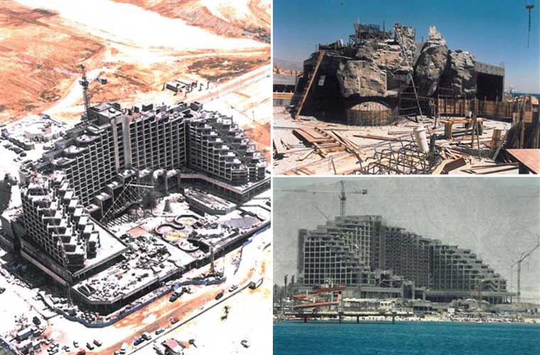
Contrary to Fenchel’s plan, which comprised of a 20 storied tower, perpendicular to the sea, following the customary design of hotels built in Tel Aviv, Dan Eilat’s architects decided to angle the hotel’s façade facing the sea, so that all the guest rooms and most of the Hotel’s public spaces will have it in view. The need to protect the public areas and particularly the swimming pool from Eilat’s strong northern wind, gave the Hotel its U shape. Instead of Fenchel’s monolith, Dan Eilat was now planned as a three-winged building, with its two exterior wings terraced and the middle wing reaching 14 stories high. In order to somewhat break the façade’s symmetry and the conservative design, a sculptured element, composed of two slanted triangular roofs and glass screens, was added to link the lobby and pool, as well as to provide shade for the lobby.
The architects travelled as far as the Technion in Haifa in order to examine the wind patterns and position of the sun at the Hotel. Komet remembers the experimental phase in the planning process: “Because Eilat’s tourist season is at its peak in December and January, we had to make sure that the swimming pool receives direct sunlight most of the day, and that it is visible from most rooms. The terracing was in fact decided upon following an experiment we had conducted at the Technion.
At the time this was the only place one could perform an experiment that today can be done from any office using a computer program. We also built a three-dimensional model together with Prof. Edna Shaviv, which allowed us to illustrate and convince Dan’s management of the need for the building’s U shape in order to protect the pool from the northern currents. We brought the model to the wind tunnel at the Technion’s Department of Aeronautics and there decided on the building’s final position.
The concept
“I tried to see what made other hotels a place that people loved coming back to again and again”, Federmann recounts in the chapter dedicated to the Hotel in The Hoteliers, a book that depicts the history of the senior hotel chain. “I could think of two such hotels in the immediate surrounding: the Dan Accadia Hotel, and what used to be the Sonesta Taba Hotel. I tried to analyze what it was that people liked in these two hotels, and found some common characteristics, the most prominent of which was that in both hotels life revolved around a central focal point. In Dan Accadia it was the pool, and in Sonesta it was the beach and the bar at the Hotel’s heart.” Hence came the idea to tie the inside of the Hotel to its exterior – a concept that had impact on the Hotel’s overall design.
“I imagined a place where someone barefoot with a tank top would feel comfortable to walk around. I grew tired of educating guests, and realized that it is better to adapt the design to the crowd, rather than expect the crowd to adapt to the design. This understanding proved itself out, and people voted with their feet”. Federmann also said he had decided to move away from the Chain’s architectural style following the opening of the Royal Beach Hotel a few years earlier. Royal Beach’s design was based on a conservative approach, and Federmann thus had a chance to innovate and infuse the market with competition.
The rooms themselves also had a part to play as competitors, and they were designed on an exceptionally large scale. Each room received an additional 30 cm, so that their width was set on 4 meters rather than 3.70 meters. The bathrooms also received significant additional space, and included two sinks, a separate bathtub and shower and a separate toilet. The standard hotel room was 32 square meters, and a family room – 64 square meters. The logic that led to the investment in size was that design can always be altered and renewed, but room sizes remained fixed, and size will always be an advantage.
Another exceptional element is the facades’ stone cladding, which stretches across a surface of 25 thousand square meters. Normally sea-front hotels are painted white (with plaster or mosaic tiling), but Dan Eilat’s architects chose a stone whose hue echoed that of the mountains that enclose the gulf of Eilat. In order to select the stone, Federmann and his architects travelled as far as Tivoli in Italy. There they chose Travertine, a limestone whose origins lay in the traditional quarries that provided stone to buildings dating back thousands of years to Ancient Rome. “We discovered that Travertine has three different styles, depending on how it is cut”, recounts Architect Yechiel Komet in our conversation. “Cutting along the veins produces a linear sinuous texture; cutting against the veins produces a surface reminiscent of Hebron Marble, and in scission it produces a rough plastic texture. The same stone thus yields an exceptional wealth of styles. I chose one material, and achieved various results, by using different applications.”
“This was my life’s project”, claims Komet. “I was only 37 when I got the job. Accepting such a project, all the more so at such a young age, is not something to be taken for granted. We worked on the Hotel for five years, and I felt great responsibility on account of my familial tradition, as well as the Dan Hotel Chain’s heritage. I took it as a vocation, to build Eilat’s ‘King David'”. Albert Segal passed away a few years after the Hotel’s inauguration. Komet continued to plan hotels together with his partners. Among his other works he took part in the planning of the adjacent Hilton Queen of Sheba Hotel and two of Eilat’s Herods hotels. Komet was also the architect of a notorious Greek Island project which did not materialize.
The Decor:
For the Hotel’s décor, Federmann summoned Adam Tihany, an Israeli born in Romania, who had studied in Italy and gained experience as a restaurant designer. Tihany introduced to the Hotel what was at the time the latest in interior design. The total design approach gave Tihany an opportunity to design everything in the Hotel, and freed him from ordering standard items. While each of the lobby’s sitting areas was designed by a different designer, here too, Tihany accompanied the purchasing process and made sure that despite variations in design, the colors remained true to his predetermined pallet. Among the pieces ordered for the lobby, there is a sofa that was designed by Ron Arad, a one-seat version of which appeared in Michael and Janet Jacksons’ shared clip (Scream 1:50 minute), which was released the same year of the Hotel’s inauguration. By the way, after having recently discovered that such a couch was sold at auction for 120 thousand dollars, the Hotel’s manager hastened to insure the couch at the Hotel.
Nathan Joseph Slate, an American artist born in Rishon LeZion who specializes in painting metal surfaces, was invited to complete the design. His works are not particularly profound, and therefore provide an appropriate neutral background to the overall decor. Joseph coated the walls of the elevator waiting rooms on the public floors with metal sheets painted in colors that matched their surroundings: blue on the pool floor, red on the top, solid, lobby floor which leads to the dining room. Slate also designed several walls in the conference rooms’ area, and provided a picture for each of the 375 guest rooms.
The Dan Chain signed a deal with Joseph, purchasing all his works for 200 thousand dollars, but since then the value of his works has risen, and each guest-room picture is estimated at 3,000 dollars. Today the gamut of his works at the Hotel is estimated at over 2 million dollars.
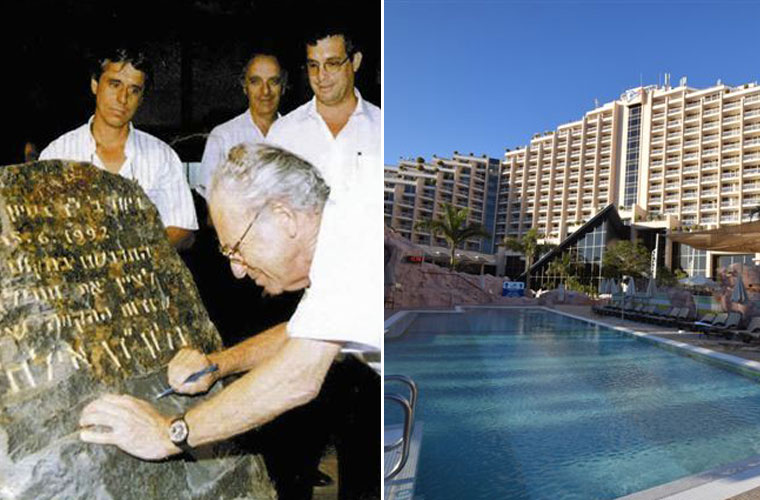
In 1992, the Hotel’s construction begun, and its inauguration took place three years after. A fire, an earthquake and the murder of Prime Minister Rabin delayed and diminished the scope of the opening events for the Hotel which was considered a breakthrough in the Israeli hotel market in general, and in Eilat’s hoteliery in particular.
Architectural tour
A visit to Dan Eilat can turn into a one to two hour long architectural tour. Every detail here was designed especially for its location, and one can learn not only from the choice of shapes and colors, but also from the proportions and material selection.
Generally speaking, quite a few of the various Dan hotels were designed by renowned architects. Dan Tel Aviv has best preserved Heinz Fenchel’s interior design (winner of the first Rechter Prize) and the facade that had later been created by Yaacov Agam. Dan Panorama Haifa has his designs in the guest rooms, halls and dining rooms. Dan Accadia’s and King David’s décor are considered classic.
Among the Chain’s architects one should note David Reznik, Israel Prize laureate (who designed Dan Jerusalem, formerly Hyatt), Yitzhak Yashar, Rechter Prize and Rokach Prize laureate (Dan Panorama Jerusalem, formerly Moriah), Pascual Broid (Dan Boutique Jerusalem, formerly Ariel), Shmuel Rozov (Dan Carmel, of whom I have written here), Werner Joseph Wittkower (Dan Accadia), George Candilis (Dan Caesarea), Yaakov Rechter, Israel Prize and Rokah Prize Laureate (Dan Panorama Tel Aviv, formerly Laromme, with interior design by Dora Gad).
Michael Yakobson is an architect and geographer. He has published many books on architecture and is a regular contributor to the blog Halon Achori and to Yedioth Aharonoth’s Xnet. In 2014 Yakobson won the Rechter Prize for young architects.

